Gavekal Capital: 2013-12-08

Friday, December 13, 2013

Friday Afternoon Cocktails Anyone?

The answer appears to be 'no', taking a toll on the performance of European distillers & vintners over the last month and the last year:

image

Revisions to sales growth estimates have fallen the most of any Consumer Staples sub-industry over the last three months:

image

Meanwhile, valuations have yet to correct meaningfully:

image

One company, in particular, has seen dramatic price declines on an absolute and relative basis:

image
image
image
image


New Lows in Stocks Are Hotting Up Across Asia as they Hit 18 Month High

Even as the Japanese stock market is hanging near recent highs, there has been a fairly good amount of new intermediate-term lows being made in stocks across the Asia-Pacific region. In the last few days the number of stocks making new 50-day lows in USD terms has risen from about 7% to about 29%, which is the highest amount of new lows since the mild sell off in 2012. A closer examination indicates that Australian and Singaporean stocks are primarily to blame for all the new lows, though 18% of Japanese stocks made new lows yesterday as well. Indeed, the Australian stock market has struggled recently, and the added pressure from weakness in the AUD hasn't helped USD based investors.

image
image
image

image

Investors Are Happy About Adobe's Subscription Adoption

Adobe is up over 10% today after releasing their financials for the fiscal 4Q after the bell yesterday. Adobe has made a strategic shift from a licensing model to a subscription model. This has angered quite a few customers but  it seems that customers are making the shift nonetheless. The transition is happening faster than management originally laid out. They are on track to pass goals set for 2013 as well as for goals in 2014. The latest quarter’s sales and EPS actually came in lower than expected (due primarily to promotions and the fact they are selling fewer full versions of its highest priced desktop software) but the shift to subscriptions allows Adobe to reduce their reliance on packaged software as PC sales decline and increase their annualized recurring revenue (ARR) goals. It seems there are only blue skies ahead for Adobe in the near-term. 

image 

image

Thursday, December 12, 2013

Is the Yen Hinting at a December Taper?

We've been highlighting how S&P 500 futures and the YEN/USD cross have basically been moving tick for tick recently, so we thought it prudent to point out that the relationship has basically dissolved over the last two days, and in fact has started to reverse. Since Tuesday S&P 500 futures have fallen by about 40 points to 1768, which would imply a YEN/USD cross of 101.5-102. Instead we have the yen trading down to 103.4, which given the timing we have to chalk up to an anticipation of a taper next week (and thus a stronger USD). Time will tell, but the action in the bond market (10Y yields are up 8bps since Tuesday) would support this view.

image

We're Back to a Macro Driven Market Over the Last Week

After a short reprieve in which fundamental factors drove market returns, the last week has been all about the macro. Macro factors (and specifically stocks' correlation with the euro) filled 4 out of the top 5 spots in our factor scoring work. This would seem to coincide well with US monetary policy bring front and center ahead of next week's big taper/no taper decision.

image

Decomposing the S&P 500 PE Ratio: How Can the Market PE be "Low" and Stocks be Expensive at the Same Time?

One unfortunate reality of market cap weighted indices is that statistics derived from these indices are inherently skewed by a handful of megacap companies. The P/E ratio is no exception. What we find is that the top 10 companies in the index comprise 18.5% of the market cap and 21.4% of the earnings, and these companies have an average forward P/E of 14.3. On the other hand, the bottom 450 companies, which comprise only 52% of the market cap and 47% of the earnings, sport a forward P/E of 21.4. When all company's earnings are contributed into the market P/E calculation the result is a P/E ratio of about 15. This P/E ratio could be viewed as "low" relative to all-time peak valuation of around 25 in 1999, but we highlight valuations topped out at about 16 in 2007. Furthermore, with the average stock trading at more than 20x next year's highly subjective earnings, it's easy to call the average stock "expensive".

image

image

Shaky European Market Internals

In addition to extensive fundamental analysis, we spend a good deal of time investigating the internal characteristics of broad groups for useful trends and insights.  Beginning with breadth, we look at advance decline ratios.
Every day we count the number of stocks that were up and the number that were down.  From there, we create a ratio of advances/declines (stocks up and stocks down).  Importantly, the a/d line is measure of breadth.  If the a/d is 2/1, then 66% of the stocks were up and 33% of the stocks were down.  If the a/d ratio is .66, then 40% of stocks were up and 60% were down.  We then take that daily calculation and perform various additional calculations, such as looking at the 200 day moving average or the 1 year cumulative sum.  For the cumulative sum, we just keep a running total of the daily a/d calculation for 252 trading days (1 year).
It is important to note that we calculate our own stats for equal-weighted market indices.  Equal-weighting is an important first step in analyzing market internals.  Whether it’s a/d ratio, net advances, or new highs, the calculations are based the number of companies, not the size.  North America is about  44% of the equal-weighted MSCI World index.

image

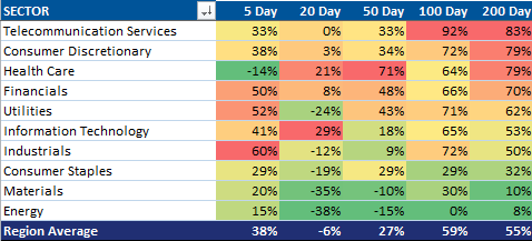
Looking more closely at Europe (but keeping in mind that trends between regions are mostly similar right now), we see that there are 442 companies in the MSCI Europe Index.  Below is the (equal-weighted) sector breakdown:

image

The 200 day a/d line has fallen from 9/1 in early 2012 to 2.5 today.  That means as of December 2012, over the previous 200 days, 90% of the stocks were up and only 10% down.  Currently, with a reading of 2.5/1, roughly 71% of the stocks were up and 29% were down over the last 200 trading days.  If, for the sake of argument, the a/d ratio was 1/1 (50% of stocks were up and 50% were down) every day for 1 year, the 1 year cumulative a/d ratio would be 252.  The current reading is about 1,000 (which means the a/d ratio averaged roughly 4.3/1 over the last year).

image

image

Breadth is clearly deteriorating-- and a few more data points reinforce this observation.  Over the last 200 days, a net 83% of European telecom stocks rose.  At the same time, only a net 8% of European energy companies experienced positive performance.  The deteriorating breadth in Europe is due largely to three sectors: energy, materials, and staples.

image

An important complement to breadth is to measure the percent of days that stocks are up and down.  While breadth has been deteriorating over the last year, this effect has been overwhelmed by the fact that stocks have experienced more days up than down.  We measure the trailing 88 days of returns and calculate the percent of days stocks were up and the percent of days they were down.  The current reading is 50%, so over the last 88 days, European stocks were up 44 days and down 44 days.  Notice that all year so far this metric has been above 50% (1 year moving average is 59%, green line) meaning that there were more days when stocks were up than down.  2013 is the first year since the March 9, 2009 low where the percent of up days has been over 50% all year long.  As one can see in the chart below, the last time stocks were this detached from a “random walk” was 2006/2007, and importantly this metric started sliding almost 1 year prior to the 2007 peak in prices.  It sort of looks like mid-2007 according to this metric…

image

So, to sum up, underlying the rise in European stocks over the last year were two factors:
1.  Declining breadth-- fewer stocks are going up relative to those going down.
2.  Statistical run-- almost 60% of all trading days have been up over the last year.

US Posts Strong November Auto Retail Sales

November's retail sales posted a strong 0.7% month-over-month gain which was slightly above consensus expectations (0.6%). This is even more impressive when we consider that October's 0.4% gain was revised up to 0.6%.

image

Auto's contributed to the strong retail number as they gained 1.8% month-over-month to an all-time high. Import prices also showed that imported auto prices declined by 1.4% year-over-year. This deflationary pressure on auto prices from abroad looks like it will continue in the near future.

image

image

Retail Sales Report Highlight Another Problem For Housing

Monthly retail sales of building materials have been unchanged since April of this year.  This is just another piece of evidence suggesting a real lack of strength in housing related activity.

image

Europe: Disappointing Industrial Production

Contrary to an upbeat PMI Manufacturing report earlier last week and expectations for a 1%+ gain, Industrial Production in the Eurozone fell more than 1% compared to the previous month and remained barely positive when compared to last October:

image

The decline was broad-based, affecting all sectors of use (except intermediate goods) as well as Europe's largest countries (Italy managed a small m-o-m gain):

image
image

So far, all major European markets are in the red for the day:

image


What Goes Up Must Come Down? Small Caps Have Outperformed On The Way Up

A common theme off the bear market low of 3/9/2009 has been the relative outperformance of small-cap stocks vs large-cap stocks. This latest advance since October 1st has actually seen large cap stocks outperforming small cap stocks. This has happened during a few instances over multi-year advance but not very often as the chart below shows. The question to ask is this: if we are beginning to see a longer period of small-cap relative underperformance is this another example of market breadth deteriorating and the bull market narrowing (as we have highlighted here and here recently)?

image

Wednesday, December 11, 2013

Stocks, Bonds and Gold all Stumble as Euro Soars

In an almost perfect "taper on" sort of manner, stocks had their worst day since November 7th, the 10-year treasury bond sold off by 4bps, gold finished down $9.00, and the euro rose to the highest level since mid-October, and November 2011 before that. If it weren't for the euro rising and the dollar index remaining flat, it would have been a perfect "taper on" performance.

And in case anyone was wondering, the spread between French OATs and the US Treasury bonds ticked up to the widest level (read French OATs yielding less than USTs) since April 2010 (right before stocks sold off). The risk seeking behavior implied by the OAT-UST spread boasts an excellent correlation with the forward P/E ratio of the S&P 500, though we fear French deflation risk is what is now driving the spread.

image

image

image

image

image

This Bull Market Is Narrowing As It Advances...Market Breadth Continues Deteriorating

The advance-decline ratio is a market breadth indicator that compares the number of stocks that closed higher with the number of stocks that closed lower than their previous day's closing prices. It's a useful tool to understand whether there is broad participation in a market move or if a few very large cap stocks are driving indices one way or another.

We like to look at this data point from various time perspectives. For a longer term perspective, we look at the 200-day moving average of the advance-decline ratio. We also look at the one-year cumulative advance decline ratio. This is a one-year running total of the advance-decline ratio.

The main point here is that no matter how we slice it, market breadth is deteriorating as the rally continues on. Participation is narrowing which would imply the foundation of this bull market is showing some cracks. Below are some charts that visually display this deterioration.

image

image

image

image

image

image

image

image

image

image


Another Technical Divergence

Everyday we tally a measure called 1 quarter cumulative weekly net advances.  Here is how it works. Each week we calculate the number of stocks that advanced and the number of stocks that declined, and then we net out the result.  We then keep a running tally of those weekly net advances over 13 weeks, hence the name 1 quarter cumulative weekly net advances.  When momentum is rising, we generally see a rising figure, and when momentum is stalling, we see a falling figure.  The most interesting times are like what we are seeing now: falling cumulative net advances while index prices hold steady.  This is a technical divergence that general is a red flag for stocks.  Below we show the figures for the MSCI World index and each of the MSCI regional indexes.

image

image

image

image