Gavekal Capital: 2014-03-09

Friday, March 14, 2014

Market Breadth is (Still) Weak and Getting Weaker

Measures of market breadth can give us important clues as to what is happening underneath the surface of major stock indices so we can make better decisions. For instance, when we see that a preponderance of stocks are trading below their 200 day moving average, there is a good chance the market is oversold and likely to rally. By the same token, when we observe that a large percentage of stocks are making new 100 or 200 day lows it is a good indication that the particular index has experienced a selling climax and is therefore unlikely to sustain significantly deeper losses. Unfortunately for stock investors, neither of the above mentioned conditions currently hold true today. Rather, we are (and have been) noticing what we characterize as a divergence between market breadth and stock index prices (i.e. the average stock is acting weaker than headline stock indices). This is troubling because when stock market advances are sustainable market breadth indicators confirm index strength by making higher highs, thus demonstrating a high degree of individual stock participation in the rally - the opposite also being true.

In the example below we present the percent of stocks making new 100 day highs in price (blue line) and compare it to the price of the MSCI regional indices (red line). The pattern we want to highlight in this post is the following:

  1. New 100 day highs expanded off the June 2012 low fairly consistently until finally reaching an apex in late October 2013, all the way confirming the strength in the index price
  2. Around the new year, indices made new cycle highs, but the percent of stocks making new 100 day highs was lower than in October 2013
  3. Around February 19th, stock indices again made new cycle highs, but the percent of stocks making new 100 day highs was even lower than the reading around Jan 1
  4. On March 6th, stock indices again made new cycle highs and this time the bounce in new 100 day highs was not even observable
So we are now in a situation where the past three stock market highs have been achieved with an ever narrowing list of stocks making new highs. That is an unsustainable situation, which generally points to lower prices unless broad stock participation picks up meaningfully. We will be watching for exactly that on the next rally attempt. 


image

image

image

image


Yesterday Was Only The Eighth 1% Down Day In 6 Months, Likely With More To Come

Yesterday was only the eighth day the S&P 500 closed down by more than 1% in the last six months, or 126 trading days. To put this in some historic context, at deep oversold lows, the number of trailing days down over 1% is in excess of forty.  Single digits readings are more consistent with intermediate to longer-term tops in stocks.

image

Our work relating this equity metadata to the Federal Reserve's tapering suggests we should expect more 1% down days over the course of this year.  We have modeled out the Fed's taper trajectory, calculating the 3-month increase in the Fed's balance sheet through this year, and the relationship suggests that if the Fed pushes ahead with its tapering, the occurrence of 1% down days should pick up.

image

A Tough Week for Many-- European Materials Stocks, in Particular

It has been a tough week for equity markets around the world.  In Europe, the Materials sector has been particularly weak:

image

And, while the group has few constituents that show a high likelihood of outperformance in the near future, one member distinguished itself with especially negative performance this week:

image

In the wake of announcing a dramatic cut to its dividend, the German fertilizer and agricultural chemicals company saw stock prices fall significantly.  Our relative strength point-and-figure chart (versus the MSCI World Index) shows weakness extending back to 2011:

image

For now at least, the bearish downtrend line seems likely to remain intact.

Price To Sales Multiples Show Investors Valuing Revenues More Than Ever

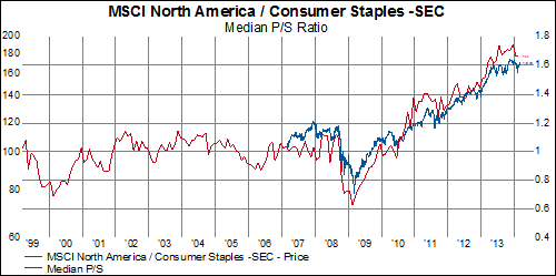
Regular readers of our blog know that we tend to look at the equity markets from an equal-weighted perspective because stock indices can sometimes be deceiving merely by how they are constructed (cap-weighted like the S&P 500 or price-weighted like the Dow). Equal-weighting allows us to understand how the median company is performing and this is particular useful when looking at valuation metrics. When we take a look at median P/E, median P/CF, median P/S, and median P/B, P/S stands out as looking particularly rich. This is especially true when we look at just North America.

The median P/S ratio in the MSCI World is 1.73x. This is exactly equal to the high in 2007 and higher than the high seen in 2000 (which was 1.53x). In Europe, median P/S currently is about 10% below the high seen in 2000 and about 20% below the high in 2007. For Asia-Pacific, median P/S currently is currently about 20% higher than in 2000 but about 15% lower than the high in 2006. Finally, in North America, we find that current median P/S sales higher than the highs in 2000 or 2006.

image
image
image

When we dig into North America by sector, we really can see where the richest valuations are because the sectors are trading at different historical levels. Here are the sectors trading at nearly all-time P/S multiples (consumer discretionary, consumer staples, health care, industrials, and utilities).
image
image
image
image
image

This second group, made up of hyper-cyclicals and late-cyclicals, have not experienced the multiple expansions that the previous group has had.
image
image
image
image
image


Thursday, March 13, 2014

More Weak Chinese Econ Data Confirms Copper Rout

Chinese economic data continues to come in on the weak side as today brought disappointing retail sales and industrial production figures. These data represent January and February cumulative totals so they should not be affected significantly by the timing of the Chinese New Year holiday. The retail sales series shows the slowest YoY growth since 2004 while the industrial production series is the weakest it's been since 2009. Perhaps unsurprisingly, industrial production growth in China boasts a relatively tight relationship with copper prices (since copper is a raw material component of almost all durable consumer products) and two seem to be confirming one another's downside breakouts.

image

image

Where Does it Pay Dividends to Chase the Yield?

Over the last year, dividend yield ranks as one of most important factors in MSCI World stock performance:

image

image

Which begs the question: where are the most positive dividend yield trends?  Currently, the Telecommunication Services sector has the highest dividend yield in the MSCI World Index:

image

However, the Telecom sector also happens to have the largest portion of its companies cutting dividends-- versus Consumer Staples, where more than 76% of constituents are raising their dividends:

image

In addition, we find that Consumer Staples companies have increased their dividends more consistently over the last three, five, and ten-year periods than any other sector:

image

Of course, each region has its own unique trends:

Asia-Pacific
image

Europe
image

North America
image

Deflation Fears Return: A Red Flag For Stocks

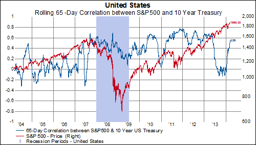
Prior to 1997, the dominant fear in the capital markets was inflation, and this resulted in a structurally negative correlation between stocks and bonds.  After the Asian crisis, the dominant fear shifted to deflation, and the structural correlation between stocks and bonds flipped positive.

In the years after the Global Financial Crisis (2009-2012), correlations were extremely elevated, reflecting extreme deflation tail risk.  In 2013, with the backdrop of another round of quantitative easing, shorter-term correlations plunged, suggesting the market was pricing out extreme deflationary risks.  This was a good environment for stocks.

Now, shorter-term correlations between stocks and bonds have flipped strongly back into negative territory.  This suggests the market is quickly re-pricing the likelihood of a deflationary shock.

image

A surge in the correlation between stocks and bonds preceded the 2010 and 2011 equity market corrections.  The recent increase is a red flag for stocks.

image

Asset-Backed Commercial Paper Market Is 1/6 The Size It Was in 2007

At the peak of the of shadow banking system in 2007 total asset-backed commercial paper (ABCP) outstanding was over $1.2 trillion (or 8.3% of GDP). Today, ABCP outstanding is about $233 billion (or 1.4% of GDP) and still declining. Issuance is down even further as it currently stands at only 10% of peak issues in 2007. One could assume that the collapse of this market has had a major impact on the velocity of money in the US economy (and perhaps globally).

image

image

image

Wednesday, March 12, 2014

What is the Signal in the Chinese Trade Data?

The Chinese trade data from last weekend has gotten a fair amount of play in the media over the last few days. On one hand we have imports surging 10% YoY and on the other we have exports plunging by 18% YoY. Strong imports signal a healthy domestic economy in China (a positive for foreigners who export to China) while weak exports signal less demand for Chinese products from abroad. Throw into the mix the fact that the Chinese New Year distorts massively the statistics in January and February and one is left with more questions than answers.

image

We don't think it has to be that complicated, however. One quick way to adjust for the erratic data each January and February is to simply take a two month moving sum of the data and then calculate the YoY % change. This method smooths out the noise so we can more easily determine the signal. What we find is that import growth is still robust and that the decline in exports is much less than the February data suggests. So doing away with hyperbole, it seems that Chinese demand on the surface seems ok (and maybe the Chinese economy is actually rebalancing a bit), but that exports, in showing their first YoY decline since 2009, are painting a darker picture of global demand. A more cynical take on the strong imports would assume the data simply means foreign subsidiaries of Chinese companies are over-invoicing the parent company as a means to get capital out of China. Perhaps this is happening on the margin, but for now we'll go with the optimistic story and believe that China is, finally, starting to rebalance.

image

The End of Commodities' Relative Underperformance?

With an impressive jump in coffee futures and a breakdown in copper, commodities have received a fair amount of attention so far this week.  Indeed, they recently broke a multi-year trend of underperformance versus equities:

image

For a different perspective, we also like to look at commodities indices and individual commodities through our relative strength point-and-figure methodology.  Our proprietary charting system is designed to dampen the noise associated with short(er) sighted fluctuations in price, helping us to better see the dominant trend in a particular stock or, in this case, commodity.  In this light, the CRB Index (relative to the MSCI World Index) has quite a bit of ground to cover before we might call the outlook positive:

image


On an absolute price basis, however, the downtrend does seem to have eased.  Do we see the beginnings of a base?:

image

Economic Data In The Red Zone

All year the Citigroup Economic Surprise indicator has been slipping, reflecting the weak economic readings lately.  Over time, we have found this indicator to be helpful in identifying more risky periods for equities.  In general, as the index slips below zero, the distribution of forward 3-month returns skews negative.  This is indicated in the lower left quadrant of the chart below, the one that is highlighted in red.  Conversely, when the Citi Surprise index is in positive territory, the distribution of returns is skewed positively.  The latest reading of -38 is pushing us further into the red-zone, with negative potential consequences for the equity market.

image

Perhaps more concerning than the level of the Citi Surprise index is the fact that the stock market has just recently begun to take notice.  In 2013, the correlation between the stock market and the Citi Surprise index was negative, a stark contrast to the 2009-2012 period where correlations were very high.  As correlations flip positive it suggests the equity market is redirecting its attention back to the economy, and away from the Fed.

image

Europe and North America Are At Overbought Levels...Asia-Pacific, Ehh Not So Much

A simple way of looking at longer-term momentum is to look at the percent of stocks trading above their 200-day moving average. When this figure reaches 20% we say that the index or sector is at oversold levels. This tends to mark more advantageous buying opportunities. When 80% or more companies are trading above their 200-day moving average we identify that as overbought levels and generally this is negative for future returns of that index or sector.

We currently have overbought conditions in the MSCI Europe and nearly overbought (78%) in MSCI North America. However, MSCI Pacific is nowhere near those levels and currently sits and a "middle of the road" 47%.

image

image

image

image

Tuesday, March 11, 2014

Macro Factors are Back on Top According to Our Factor Scoring Work

The last week has seen some interesting developments in geopolitics, Chinese finance and copper prices. Amid all that it maybe doesn't come as a surprise that macroeconomic factors such as the yield on treasury bonds and the price of oil have topped our list as the most significant factors driving world stock prices over the last week. We will be watching carefully over the next few days the evolution of our factor work to see if macro factors continue to dominate the direction of stock prices.

image

No Pain, No Gain: European Banks

News that Italian bank UniCredit posted a large loss for the fourth quarter-- as it endeavors to clean up its balance sheet and cut its workforce in the face of the ECB's pending review of large banks-- was met with investor enthusiasm, sending shares up more than 6%.  In fact, most banks in the MSCI Europe index have been performing well so far this year:

image

Is this positive performance the group's reward for its progress in reducing short-term debt levels from an industry average of over 200% in 1993 to over 100% in 2009 to just 41% today?:

image

More than half of the group continues to trade below book value:

image

That could change if investors continue to search for value among European financial stocks:

image

And, in turn, we could see more point-and-figure charts with the beginnings of break-out patterns as these companies work to emerge from multi-year bases:

image