Gavekal Capital: 2014-07-06

Friday, July 11, 2014

The Flow of QE Suggests Lower Bond Yields and Stock Prices

The Fed is set to conclude its nearly six-year-old experiment with quantitative easing (QE) and the Federal Reserve Board has clearly laid out the most likely course for termination of the program. This clarity allows us to accurately project out the ultimate size (at least in the short-term) of the Fed's balance sheet (chart 1) and also the rate of change in their balance sheet throughout the remainder of QE (chart 2). Chart one measures the level of the Fed's balance sheet while chart two measures the flow of asset purchases. We calculate the flow of assets by taking the three month difference in the size of the Fed's balance sheet.

While academic literature exists that suggests the key variable in QE is the level of Fed assets, our own empirical analysis over the last few years suggests the flow of purchases is the key variable affecting at least stocks and bonds. To illustrate this point we overlay the flow of assets and the likely course of flows (which we have termed our "Taper Model") from the second chart onto various bond and stock variables.

image

image

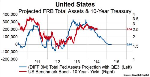
In the below two charts we show our Taper Model (blue line) overlaid against the United States 10-year treasury yield (first chart) and 10-year TIPS yields (second chart). We can clearly see that over the last four years the rate of change in Fed assets has been positively correlated to both nominal and real bond yields. As the flow of assets has increased, bond yields have tended higher, and vice versa.

image

image

In the next three charts we overlay our Taper Model (the red line this time) on a few stock market variables. The first chart shows the MSCI World Index, the second shows the percent of stocks in the MSCI World Index above their own 200-day moving average, and third shows the performance of counter-cyclical stocks relative to cyclical stocks across the MSCI World Index. From these examples we can see that the flow of asset purchases appears to be positively correlated with stock prices (first chart), stock market breadth (second chart), and cyclical leadership (third chart).

image

image

image

Conclusion: 
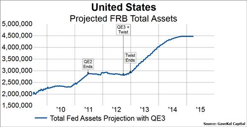
The Fed has clearly laid out its plans for the termination of QE. This allows us to project both the level of Fed assets and the flow of asset purchases through the remainder of the program and opine about the most likely scenarios for bonds and stocks. Our experience with QE suggests that the flow of asset purchases is the key variable affecting bond and stocks. Given that we have observed positive relationships between the flow of asset purchases and bond yields, our Taper Model suggests lower nominal and real yields in the months ahead as the flow slows to $0. Similarly, the Taper Model suggests a more defensive stance is warranted toward stocks as the model points to lower stock prices, deteriorating stock market breadth, and counter-cyclical leadership.

Friday Flush - S&P 500 Charts Edition

We usually prefer in our blog posts to give the reader a nice linear explanation of what we are laying out in front of them. Sometimes, however, when we are perusing our chart library we find a variety of charts that are interesting but are not exactly on the same theme. These charts still seem worthy to share, however, and since Fridays are a good day to shake things up we are calling this post our Friday Flush - S&P 500 Charts Edition because we are flushing out some of our more interesting but obscure charts on the S&P 500 with limited commentary.

The S&P 500 has spent most of this year pressing up against it's 65-day high and has only once touched the 65-day low
image

So far in 2014, the equal-weighted S&P 500 index is outperforming the cap-weighted S&P 500 index by a little over 1%.
image

The equal-weighted financial index are also outperforming market-cap weighted financials index.
image

And banks continue to underperform the S&P 500.
image

Small Caps relative underperformance to Large Caps is following our taper model nicely.
image

image

Junk spreads are wondering when the S&P 500 is going to follow them down...
image

image

Commodities continue to refute the most recent stock market advance.
image

image

image

On the other hand, auto sales are moving in step with equity prices but are not at all-time highs.
image

Cash assets at US commercial banks are also increasing with equity prices.
image

Finally, durable goods orders have been able to break out to a new high yet.
image


Cracks in European Momentum

This week, the percent of issues above their moving averages fell across all time dimensions for MSCI Europe, registering an oversold condition on a shorter-term basis:

image
image
image
image
image
image

Looking at the data in tabular format, the momentum weakness in Europe relative to other regions and the world has become more pronounced.

MSCI Europe
image

MSCI World

image

MSCI Asia Pacific

image

MSCI North America

image

Thursday, July 10, 2014

Industrial Production - The Haves And Have Nots

With the disappointing May industrial production numbers for Italy (-1.2% MoM) and France (-1.7% MoM) out today, we thought we would try and place them in a simple historical and global context. In the charts below, we are looking at industrial production of major developed countries around the world across various time perspectives. We are indexing the the level of production at 100 at whatever the starting point of the chart is so that each series is on equal footing as much as possible (granted every country has different data methodologies). The themes across different time slices are all basically the same: 1) Australia, Canada, and the US have all grown production nicely over the long-run and since the Great Recession 2) Germany, especially in the last decade, has separated itself from the rest of Europe 3) UK, France and Italy have not recovered from the Great Recession from a production standpoint and are below 1990 levels 4) Japan has bounced back from the Great Recession but not from the excesses built up in the 1980s.

image

image

image

Putting This Bull Market Into Historical Perspective: History Suggests It's Extended

Yesterday we wrote about the how the current price level of the S&P 500 was about one standard deviation higher than its four year moving average price level (last chart below). We noted the rarity of this event, but stated that this precludes neither further market gains nor weakness, based on history. Indeed, there have been five instances in which stocks rose to two standard deviations above their four year moving average and at least ten instances where 20% market declines occurred when prices were at or lower than one standard deviation above their four year moving average.

Today, we'll take a slightly different tack to try to put this current bull market into historical perspective. Instead of analyzing the S&P 500 we'll use the Dow Jones Industrial Average since we have price history going back to 1900.

In the table below we have sorted from largest to smallest all of the cyclical bull markets going back to 1900. In the leftmost column is the total percent change of the cyclical bull and to the right of that is the start date of the cyclical bull. The rightmost section indicates the cumulative performance after each anniversary of the bull market. For instance, the current bull market that started in March 2009 has seen the Dow advance by 159% to date, and as of its fifth anniversary it had advanced by 135%. The key takeaway here is that the current cyclical bull is the sixth largest in history in terms of total price gain. 

image

The next table below replaces the total performance column (the leftmost column) with the total duration (in trading days) of the cyclical bull market. From this perspective the current cyclical bull market is the fourth longest in history. It's also interesting to note that the only other two bull markets that had a larger gain as of their fifth anniversary were the 1921 bull that preceded the great depression and the 1982 bull that preceded the crash of 1987. In both cases the Dow went on to achieve significantly higher prices before eventually topping out.

image

image

Conclusion:
No matter how one analyzes this bull market, either in terms of percent gain, duration or extension from its long-term moving average, history suggests that this bull is extended. There are precious few instances of bulls with larger price gains or longer duration, but they do exist and should not be ignored. For investors this means analyzing the pillars on which bull markets are created: liquidity, valuations and growth. Current conditions point to less liquidity, extendedvaluations based analyzing the median stock or cyclically adjusted valuations, and continued low growth.
 

Type Two Errors & Stock Market Corrections

In any scientific experiment, one begins with a hypothesis and sets out to test that hypothesis.  One way to test one's own hypothesis is the formulate a null hypothesis, and if one can prove that the null hypothesis exists, then the one can reject his/her original hypothesis.

So, for example, let's say I formulate the hypothesis that when the stock market is above a Shiller P/E of 23x and counter-cyclical stocks are making new one year highs, the stock market is highly sensitive to a correction.  The first thing I would do is formulate a null hypothesis--that the relationship laid out in my original hypothesis is not true.  And then I would test whether I could prove the null hypothesis, which if I could, would be grounds to reject my original hypothesis.  I have to be careful though because accepting a null hypothesis that turns out to be false is classic statistical error--a Type 2 error.

In the chart below is a plot of the MSCI World Index with blue bars representing periods where the Shiller P/E was over 23x and counter-cyclical stocks were at one year new highs.  Over the last seven years, there are five clusters (some bigger than others) where these conditions have prevailed.  In each period, stocks were lower 1-3 months after the condition ended.  There were no periods where the null hypothesis was validated, meaning there were no Type 2 errors committed using this methodology over the last seven years.

The current cluster ended on June 5, 2014, so we are still within the window where the hypothesis is being tested.  Based on the history of this valuation/leadership indicator, we are very skeptical that we are making a Type 2 error by rejecting a null hypothesis that turns out to be true.  In other words, recent history would suggest that we accept the basic hypothesis that when the stock market is over 23x using a Shiller P/E and counter-cyclicals have recently made a new one year high, a correction is possible.

image

MSCI Europe Market Cap Still Below pre-GFC Levels

The market capitalization of MSCI North America surpassed pre-financial crisis levels in early 2013.  MSCI Asia Pacific recovered to 2007 levels last year and, more recently, exceeded them.  MSCI Europe, however, is the only one that remains below its pre-financial crisis market capitalization:

image

Within MSCI Europe, the Health Care and Consumer Staples sectors have lead the recovery in market cap and Industrials managed to regain pre-crisis levels (barely) earlier this year, but the rest of the sectors continue to struggle:

image

European Financials-- at the bottom of the group, along with the Telecom and Utilities sectors-- seemed to be on the road to recovery from mid-2012 until stalling earlier this year:

image

In spite of its inability to regain the market's favor, the Financial sector is still the largest in MSCI Europe-- and the main reason the regional index has not recovered to previous levels of market capitalization:

image

US GDP Estimates Are Falling While Inflation Expectations Are Creeping Higher

Given the plunge in first quarter real GDP in the US, it is probably not surprisingly that the full year 2014 GDP estimates are falling as well. In fact since February, according to Consensus Economics, real GDP estimates for the US have fallen by 68 basis points to 2.21% through June. So far 2015 estimates have held relatively steady at just over 3% growth.

image

What may cause some concern at the Fed is that even though growth estimates are tumbling, inflation expectations are starting to creep higher. The CPI estimates for 2014 have risen by 20bps from February to June. TIPS derived breakeven inflation has also been moving higher. The 5-year TIPS breakeven inflation is 37 bps higher than the lows made in April and the 10-year TIPS breakeven inflation is 18 basis points higher. Finally, one of the Fed's preferred measure of inflation expectations, the 5-year 5-year forward break even inflation rate, has risen by about 19 bps since early May. The positive news on this front t is that the absolute level, 2.60%, is still fairly tame.

image

image

image

Wednesday, July 9, 2014

S&P500 is the Most Extended Above its 4-Year Moving Average Since 2000

Stock prices as measured by the S&P 500 have risen some 190% from the low in March of 2009. The spectacular thrust this bull market has seen has put stocks above their moving average price levels by a wide margin. Our most recent data indicate the current price level of the S&P 500 is about 33% above its four year moving average price, which is exactly one standard deviation from the mean going back to 1931. We point this out to highlight two facts:
     1) history suggests that stock prices could continue to surge higher relative to their four year moving average, as they did in 1936, 1946, 1955, 1987 and 1998
     2) history suggests that item number 1 is not a precondition for major stock market weakness as evidenced by declines of 20% or more in 1938, 1961, 1966, 1968, 1973, 1976, 1981, 1990, 1998 and 2007.

image

Strong Stock Market Closes are Reflecting Investor Confidence, but Could Reverse Soon

In our daily work we monitor the intraday price action of the major stock indexes in an effort to gauge investor conviction. A string of strong stock market closes is one indication of strong investor conviction, and vice versa. As such we developed some tools to help us measure strong and weak stock market closes, which we call our GaveKal Capital Market Close Indicators.

In a post about two months ago we opined that weak stock market closes were on the rise because our Weak Close Indicator had troughed and had begun to move higher. That is not exactly how things have played out. Instead, weak closes have diminished and strong closes have turned up, which has led to our Net Close Indicator turning back up to near a record high. Our Net Close Indicator simply subtracts the value of the Weak Close Indicator from the Strong Close Indicator.

This is an important development because the Net Close Indicator for the S&P500 hit a level two days ago that has only been eclipsed three other times in the previous 30 years (May 2013, March 2011 and July-February of 1995-1996). That level, a reading of 32, also happens to be two standard deviations from the mean, which demonstrates just how extended the Net Close Indicator is at the moment. Since this is a mean reverting series with no trend, if history is a guide we should now expect weak closes to pick up and strong closes to diminish. Such action in the past has coincided with weakness in the stock market, though not always. In 2013, for instance, the Net Close Indicator fell from a record 45 to 7 while the market marched significantly higher. Nonetheless, it is something to monitor.

image

What Has Happened To Mortgage Applications?

The first of half of 2014 saw the lowest average level of mortgage applications in the United States since the second half of 2000. This has occurred in tandem with a 44 basis point drop in mortgage rates since the beginning of the year. The inverse relationship between mortgage applications and rates has actually been quite strong over the 25 years.

image

image

Refi's drove the mortgage application index higher from 2009 to mid 2013. This index has fallen by nearly 75% since the middle of 2013 when mortgage rates sharply rose. However, as we mentioned above, we haven't seen any rebound even though mortgage rates have been falling again.

image

Something seems to have structurally changed since 2009 for the purchase application index. The purchase index has been basically flat now for four years even as we have seen an increase in new home sales and existing home sales . From 1990-2008, the purchase application index had a -0.86 correlation to mortgage rates. However, since 2009, that correlation has actually flipped to a positive correlation of 0.51.

image

image