Gavekal Capital: 2015-03-29

Thursday, April 2, 2015

Time To Take A Hard Look At Juniper Networks

Academic research has shown that not all research and development (R&D) is created equal. In every industry, you have two sets of companies: Knowledge Leaders and Knowledge Followers. On the one hand, you have Knowledge Leaders which are companies that introduce new and innovative products. These type of company's follow a strategic innovation strategy. On the other hand, you have Knowledge Followers which are companies that mimic or react to the innovations in the marketplace created by Knowledge Followers. These type of companies follow a strategic mimicking strategy. It may surprise some readers that both sets of companies undertake R&D. Knowledge Leaders undertake R&D in order to push the technological frontier forward. Knowledge Followers undertake R&D in order to take advantage of the productive R&D spillover effects created by Knowledge Followers. The first car company that creates a self-parking vehicle is truly innovating and it takes a lot of R&D in order to get the performance of that innovation just right The second, third and fourth company that mimics this innovation still must undertake R&D  in order to keep-up with the first car company. However, their R&D intensity is most likely much less since they will benefit from some of the knowledge that has inevitably spilled over from the innovations created by the first car company. This is all makes intuitive sense. What is eye-opening is that research has shown that the R&D undertaken by the first company, the innovative R&D, is actually LESS risky than the mimicking R&D as judged by risk measures such as future stock return volatility and earnings variability. This leads to alpha opportunities for investors who know where to look.

This fact has a profound impact on company valuations when one appreciates the distortion that conservative accounting has had on judging corporate innovative activities. In 1974, the Financial Standards Accounting Board (FASB) introduced SFAS No. 2. which stated that all R&D expenditures must be treated as current period costs. Now, regularly readers know that we disagree with this and believe that this type of accounting procedures obfuscates the true value of a company. It is worth noting that the US Bureau of Economic Analysis (BEA) and the United Nations statistical arm also disagrees with this accounting treatment and they now include R&D as output in the calculation of GDP. In our work at Gavekal, we adjust financial statements by capitalizing R&D and other innovative investments, carry them on the balance sheet as long-term assets, and depreciate those assets just as you would property, plant and equipment. By doing so, this gives us a much clearer perspective of the true capital stock of a company of which future earnings are derived from.

With all that in mind, let's take a look at a communications equipment Knowledge Leader, Juniper Networks (ticker: JNPR) . JNPR invests heavily in R&D. They currently invest 21.8% of their sales in R&D, the most among their competitors. They invest another 8.1% of sales in other intangible investments such as brand building and worker training. Consequently, they invest nearly 30% of its sales in intangible investments and only 4.2% in traditional fixed capital. This massive investment in productive intangible capital is completely missed when one looks at traditional financial statements.

Intangible-Adjusted Investment Profile
image

These investments are not a one-off decision either. This is all part of a strategic plan by JNPR's management. JNPR has been investing 21.4% of their sales on average in R&D for over a decade. This has created nearly $4 billion in additional assets (at historical, depreciated cost) that is unaccounted under traditional accounting practices.

Investment In R&D Over The Past 10-Years
image

As-Reported Balance Sheet Levels 
image

Intangible-Adjusted Balance Sheet levels
image

JNPR has been completely out of favor with the market over the past four years. Juniper is down 46.3% while the average stock in the MSCI USA is up over 84%. While we are not in the business of catching falling knives, there are signs the negative momentum in JNPR is abating. This could create an environment where analysts are forced to play catch-up as the unappreciated additional $4 billion in intangible capital stock delivers higher than expected earnings and sales growth.

We have already seen signs that the sales and earnings growth momentum has shifted. FY1 sales estimates has fallen by over 10% over the past six months. However, over the past one and three-months it has actually risen a bit. Same goes for FY1 EPS estimates.  FY1 EPS estimates have been slammed nearly 12% lower than they were six months ago. However, the estimates have slightly increased over the past one and three-months.

Change in FY1 Sales Estimates
image

Change in FY1 EPS Estimates
image

In addition, you can make a compelling valuation argument for JNPR. JNPR currently trades at a very low intangible-adjusted P/CF ratio of 4.4x. This is by far the lowest in the communications equipment subindstry and is in the bottom 9% of all MSCI USA stocks based on P/CF. JNPR is also trading at only 1.1x intangible-adjusted book value and pays out a dividend yield of 1.8%.

Intangible-Adjusted Valuation Ratios
image

Couple all of this with an improving technical picture and the upside potential of JNPR looks promising. While JNPR has definitely been out of favor with investors over the past four years, on a relative point and figure basis JNPR has slowly been putting in a base over the past couple of years. It has clearly broken the downtrend line that was in place during its precipitous decline. That is a good first step. It is now in the process of putting in a multi-year base for which future outperformance can be propelled by. Now, the last technical question that needs to be answered is whether or not previous support (line G) is now overhead resistance. If it is, then JNPR may be stuck in a multi-year trading range. If it isn't, however, then blue skies are ahead once again and JNPR may begin to outperform in earnest.

image


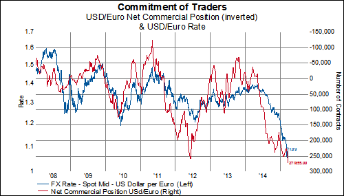
Is the Fall in the EUR Overdone?

Upwardly revised projections for growth as well as inflation (details available here), combined with stronger than expected macro data in the Euro Zone...


...and fears of a bubble in bonds, as yields extend into negative territory further out on the maturity spectrum...


...have raised questions regarding the possibility that the ECB could decide to temper its planned bond purchases.  If the relationships between asset levels and exchange rates holds, it would appear that the decline in the euro may be a bit overdone:


In addition, as we pointed out earlier this week, the number of contracts long the dollar versus the euro is at a record high-- from which a reversal would seem to suggest the potential for a stronger euro:


Wednesday, April 1, 2015

1Q 2015: Winners and Losers

As we mark the passage of the first quarter, we thought it useful to get our bearings with a quick, general summary of what has worked (or not) so far this year.  Per usual, the performance referenced below is on an apples-to-apples USD basis, and equally weighted to avoid any distortions caused by differences in market cap.

By country, equity performance in Russia has been the strongest so far (up nearly 22%) in 2015 while Greek stocks are firmly in bear market territory, having fallen nearly 25% in the first quarter:

image

By sector in the MSCI ACWI, Health Care is the runaway leader, having gained nearly twice as much compared to the closest runner-up, Information Technology.  Meanwhile, stocks in the Energy and Utilities sectors are in the red so far this year:

image

Looking at just the Developed world performance, Health Care sector leadership is even more pronounced:

image

And, while the Health Care outperformance trend holds true for MSCI North America and MSCI Pacific, the leading sector in MSCI Europe has been Consumer Discretionary:

MSCI Europe
image

MSCI North America
image

MSCI Pacific
image

Emerging market equities have struggled across a wider range of sectors, with nearly half in negative territory year to date:

image

By region, Energy in MSCI EMEA has actually been the best performer so far in 2015:

image

Every sector in MSCI Latin America is negative, with Health Care down more than 30% ytd:

image

MSCI Emerging Asia, by contrast, has just one sector in negative territory for the year so far:

image

"Well, you know this is a bull market [in government bonds]!"

The action in the US government bond market over the last several weeks has reminded us of a quote from one of our favorite books on investing, "Reminiscences of a Stock Operator". Those familiar with Reminiscences will recall several scenes in which young traders are gathered at a brokerage house exchanging ideas and contemplating every tick on the tape as if it marked some monumental episode for owners of the stock. Then one of the young traders would ask a quiet veteran trader who was sitting in the corner, paying little or no attention the topic du jour, what he thought of the recent price action of some issue, to which the veteran would reply, “Well, you know this is a bull market”.

Needless to say, we feel a sense of deja vu when considering the yield action in the bond market in recent weeks. In Feburary bonds sold off massively and yields had an epic rise in the course of a month. At the time we commented that the selloff in bonds was among the largest going back to the early 1980s and that a snapback, and resumption of trend, was likely. Simultaneously, we heard nothing but how yields had just put in the low and a bear market in bonds had started. 

Since then yields have fallen back on cue, but as recently as yesterday we were reading how the minuscule move up in yields between March 24th and March 26th was evidence that the trend in yields is now higher. Allow us to disagree and remind readers that after all, "this is a bull market" in bonds. 


Construction Spending: What The US Spends Money Building

The latest (February) construction spending report was released by the Census Bureau today. This report provides a "monthly estimate of total dollar value construction done in the US" for both new structures and improvements to existing structures. It also covers both public and private projects. There are several compelling structural trends about what the US is (and isn't) building anymore provided by this report.

Overall, construction spending has flatlined since the end of 2013. Since November 2013, construction spending is only about 1.5% higher.

image

A little more than 72% of the construction that takes place in the US is in the private sector. This is below the levels that prevailed from 1992-2005 (2005 is when this data began) . However, from January 2005 to September 2010, the relative share of building done by the public sector increased by 20%, accounting for just under 40% of all building done in the US. This trend has reversed back towards historic average levels but has moderated over the past year or so.

image

So what is the US currently building?
Office space construction just made a 5-year high but is still about 31% below all-time highs set in 2008.

image

Even though commercial construction spending has fallen for two consecutive months, it is still up over 13% YoY.

image

Construction put in place for transportation has nearly doubled over the past 10 years.

image

Manufacturing construction just jumped by nearly 7% MoM in February to a new all-time high.

image

What isn't being built?

Health care construction spending is almost at 9-year lows.

image

Education construction spending is back at 2004 levels.

image
.
Spending on religious building is the lowest on record (going back to 2002).

image

Communication construction spending is at 10-year lows.

image

Tuesday, March 31, 2015

Factor Performance Shifts Away From Sales and Earnings Focus-- Except in Europe

Regular readers are aware that we keep track of the influence of fundamental and macro events on stocks by measuring the correlation between the factor in question (with the individual readings broken into deciles) and the market performance over various time periods.  And, for some time (see here), the most important factors have tended to be related to sales and earnings, whether it be the growth of those items or the estimates related to them.  The relative importance of these factors among stocks in the MSCI World has, however, waned somewhat recently:

MSCI World
image
image

The trend in MSCI North America equities is similar to that of the overall developed market index above:

image
image

And performance in MSCI Pacific stocks seems to be following the trend, even if to a lesser extent:

image
image

The importance of sales and earnings in equity performance in MSCI Europe, by contrast, remains elevated and has even grown with respect to one month changes in estimates, as well as EPS growth:

image
image

So what do estimates and growth look like for MSCI Europe right now?  The one-month change in earnings and sales estimates remains negative in every sector, while earnings are expected to grow about 10%, on average, over the next four years:

image
image

These lackluster projections and their influence on performance of European equities, combined with actual performance so far this year (see here), would seem to suggest a least a little misplaced enthusiasm for stocks in Europe.

Redux: World Inflation Falls To A New 5-Year Low

It's become a running theme, at least since last September, but the latest release of CPI numbers from around the world has brought our simple average World CPI proxy to its lowest level since the financial crisis. For the period ending in February, our World CPI proxy hit just 1.01% year-over-year. This is the lowest rate of change since November 2009. The year-over-year rate in our World CPI proxy has been falling for six months straight.

image

Oil has undoubtedly dragged down the headline CPI for many countries around the world. However, our World CPI proxy has the highest correlation (0.78) to the Citi Inflation Surprise Index which is near its lowest levels ever. 14 of the 33 countries that we track currently have a year-over-year change in consumer prices at or below 0%.

image

image

Our World PPI proxy bounced back slightly in February but still remains squarely in negative territory year-over-year (-2.43%).

image

image

image

image